
Color is one of the most powerful tools at the hand of the artist, yet so many of us ignore it and don’t practice it. I make or made the same mistakes as you and by no means I am an expert on this topic, I am on this artist’s journey just as you are. In this post, I just wanted to share my tips and tricks about this topic as I’ve been really paying attention to color these past months.
Before starting, I would really like to highlight a video by Flipped Normals called ‘The Biggest Mistake Every Artist Makes – Basics vs Fundamentals. The main focus of the video is to let you understand the difference between the basics of your craft and fundamentals, and why distinguishing them is important. Please have a look at it if you haven’t done so, as it will open your eyes for some of you and will let you understand better why the fundamentals are so important and why something such as color can impact your work so much.
This post is not about color theory and how to match colors as there are thousands of amazing sources to learn from, this will be more of a post for practical uses. I will give examples and focus more on the VFX side of things but If you are coming from another craft like digital painting, design, or really anything visual, I still invite you to stay and find what you need! Color is so universal and you can take these tips to other crafts, as these tips were also borrowed from other crafts!
Going forward I invite you to go with an open mind and learn and take what you will need. Take a cup of tea or coffee and enjoy it (it’s a bit of a long journey).
Topics that we will go over:
- Tapping into the lizard brain with colors;
- Using color palettes;
- Choosing the right values for colors;
- Choosing the right background;
- Tips for colorblindness;
- Resources.
Tapping into the lizard brain with colors
It is no secret that our brain reacts differently to different colors. Some colors can increase your heart rate, lift up the mood, or even calm you. Since color is a part of the electromagnetic spectrum, it is essentially energy, a wavelength, which has its own magnetic frequency, which can affect our neurological pathways in the brain and can create a biochemical response.

As artists, we can use this to our own advantage and communicate hidden emotions or energy through colors.
- Red & Orange have been shown to increase heart rate and stimulate our brain since their wavelengths are the longest. These responses generally lead to higher levels of activity and energy. Red is also known to trigger our fight-or-flight response and our brain generally associates it with danger. It is very easy to get overstimulated with these colors which might lead to anxiety.
- Yellow is known to be attention-grabbing and cheerful. Commonly used in advertising to evoke a sense of happiness. It is also very energizing, too much of it can lead to irritation.
- Green is known to better your focus and help with concentration overall. It is also known to have a restful and healing or rejuvenating effect on our eyes and mind. The color green is the dominant color in nature and is easy on the eye since it sits right in the middle of the spectrum in terms of wavelength. Workspaces often add lots of green to increase productivity and focus in employees (maybe you should add a plant or two on your work table 🍃😉).
- Blue has one of the shortest wavelengths and has been shown to bring down stimulation, both visually and psychologically. Light to medium blue can induce calm and rest but darker blues can evoke gloominess and overall sadness.
- Purple is actually not that common in studies but some studies show that it can help with problem-solving. It also has a short wavelength so it is also known to bring down stimulation.
Knowing this, some things might start to fall in place in VFX design, like why the heal spells are usually green or have a green tint, use light yellow or light blue but are rarely in the color red. Red usually means danger to us – why would it heal?
Colors also have symbolic meanings attached to them which vary between cultures and can have different meanings. I recommend checking this video out, it is a great summary of the symbolic meanings of colors.
Do not also forget the symbolic color meanings in video games. We all know that red is usually associated with the health bar, green with stamina, and blue with magic. Of course, there are examples where it has been switched up but these associations are just classics. So from now on, I invite you to pay attention to your favorite games, and observe what colors are used for different spells (attack, health, defense). Maybe they are trying to symbolize something too, like a paladin using white/gold color spells to evoke holiness and purity and the mage is using blueish purplish to evoke mystery? In games, It is still very common to use colors according to their original symbolic meanings as it is easier to tap into the lizard brain! The associations and meanings are already there, you just need to pick the right color (which sometimes can be a little tricky, I know). But really there is no need to reinvent the wheel, observe what is commonly used and use it yourself (steal like an artist!).
Now since symbolic meanings of colors vary through cultures, from this section I would recommend paying attention more to the color wavelengths. Simply put, warm colors like red, orange-yellow have longer wavelengths and are considered active and more dangerous (grabbing attention), while green, blue, and purple are cold colors and are passive, more calming. Remember that if active colors are surrounded by passive colors they will pop even more. Combine this theory with the timing & shape of the effect and you can have clear visual communication! Of course, sometimes it is nice to slide some hidden symbolic color associations but observing what is already used in games and sticking to that would be a safe choice.
Sometimes we cannot choose particular colors because we might have restrictions like a particular game style or we have to match the effects color to the character colors. This is totally fine, as you just shouldn’t rely on only color communication for effects. As VFX artists, we have multiple elements for communicating ideas and the more we use them together in synergy the clearer the effect will be.
Using color palettes
I love to collect color palettes from the internet and to create my own palettes beforehand! This way, when I am creating effects I don’t have to stress over it and I can simply choose the palette that I will work with.
Using palettes from the internet is really easy, you just have to google and tons of palettes will appear before you, then use the Eyedropper tool to copy the colors. I encourage choosing those pallets that really resonate and inspire you. I really like this example here, which was made by Phobs on deviantArt:
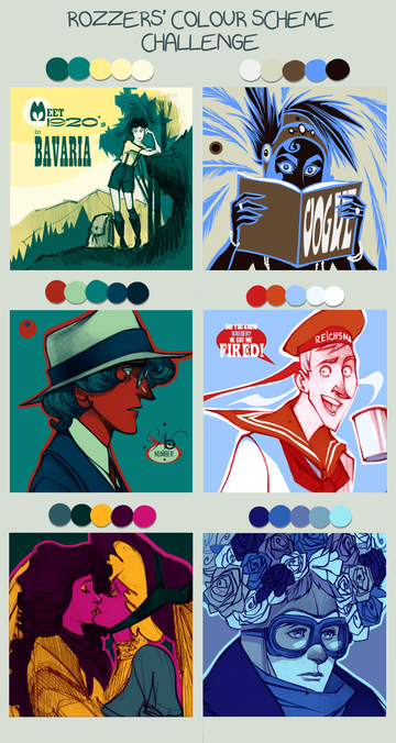
Now Phobs did not create the color palettes here but the way that the colors were used in illustrations looks really cool!
You can also find various palettes in graphic and interior design books (and they really create some yummy ones). You can get physical and e-books, they usually contain color codes so you can just type the color values once you are creating.
I personally love to create my own palettes from my everyday life. I would take a picture with my smartphone and then in Photoshop, with the eyedropper tool, lay them out. Here is an example:

I really like this method as it feels that I am sprinkling my own experiences into the work that I am doing. And really, what is better than creating and remembering the night that you danced your ass off at a party or you took a long rejuvenating walk in the forest where you could smell the forest? Better yet, nobody has to know from where you chose the colors and it can be your small secret 🤫
You can also create color palettes with images from the web, movies, Youtube videos, just find something that inspires you! I really like picking colors off of birds or marine life, the colors that they usually have are drop-dead gorgeous.
Have fun with color palettes it is not supposed to be a hard task!
Choosing the right color values
What if I told you a secret that you don’t need to use a whole range of values when choosing colors? Essentially you need to set what is going to be the brightest value and the darkest value, then work with the color values in between. If you are working on a video game, probably your Art Lead will determine the value range, if not, you need to set it yourself. Here is an example of the value range from the ‘League of Legeds’ visual effect style guide.

From this example, you can see that the highest values are reserved for the UI, so no super bright effects in this example. Of course, the value range will vary from project to project but essentially what I’ve noticed, going full 100% to 0% value range is usually a bad idea, as it usually looks pretty bad. I personally usually limit myself to around 85% and pop some HDR colors here and there. Another mistake is to use values too close to each other, this will look either too bright or too dull, you need something to make your piece pop.
You probably already know that the higher value the more it will capture the attention, so it’s a good practice to take a screenshot of your effect, convert it to grayscale, and zoom out a bit to determine if you are highlighting the most important part of the effect. If you are getting confused and your eyes are getting tired, do not hesitate to flip the image horizontally and vertically, even squint your eyes or use a blur effect in Photoshop. The higher values will always pop, and remember, if your piece doesn’t look good in black and white it does not look good in color.
To help me choose values and even colors I love to use the ‘Gamut Mask Tool For Photoshop‘ which was created by smilinweapon on DeviantArt. It is based on James Gurney’s book ‘Color and Light’.

In this Photoshop file, you get a color wheel with different masks based on the color theory (complimentary, triad. etc.) which you can rotate and move, in order to limit your color options. In the effects layer folder, there are layers where you can choose how much black or white the colors contain, essentially how saturated are they. What’s even better, since the color wheel is divided into blocks, you can orient yourself and understand what amount of color should be used in a visual effect. I strongly recommend downloading this file and trying it out for yourself (you can do it straight from deviantArt, just look for the download arrow 😉).
Choose the right background
Mostly in VFX demo reels, you will see a very dark scene with the effect glowing in it. It looks cool, doesn’t it? But in reality, games are rarely that dark. Now I understand that for a portfolio it’s OK to add a piece like that since you are showing off and all, but once you turn on that light and change to a neutral background… Oh boy, it will take the charm out of it.
Colors can appear brighter or darker depending on the surrounding colors, so it can be quite dangerous to start creating an effect on a dark background, as all of the colors will appear brighter and your effect can look great instantly (really, anything can look good with a darker background, even this site), although it may not be very useful in a game environment. For this reason, I recommend opting for neutral background color, ideally grey (not too bright or not too dark, middle-value grey) with two options for lighting – daylighting and night lighting (that you can easily switch between), to get the most out of colors and have a useable effect. This applies, of course, if you do not have a game environment scene already, if it is provided, you should be using it in the first place for the most accurate results.
Tips for colorblindness
First of all, a big YES to inclusion! We should design games for a broad audience and keep various disabilities in mind. As VFX artists, we should keep colorblindness & low vision in mind when it comes to designing effects. Of course, there is no size that fits all when it comes to this, but we can try and choose the most optimal option. First of all, I would like to recommend checking out this amazing video series that was created by Game Maker’s Toolkit called ‘Designing for Disability‘. It reveals a wide range of challenges that disabled people come across and offers solutions to game developers on how they can make the games more accessible for disabled people.

Some tips:
- I use post-processing effects in the game engine to view how the effect will look for a particular colorblindness type. Check out the ‘Accessibility Design: Color Blindness‘ post by Alan Zucconi where he provides a Unity ‘ColorBlindFilter’ package to use for your Unity projects.
- If in doubt about what colors to use – go for orange and blue, they are the most commonly perceived.
- Take a screenshot of the effect and feed it into ‘Coblis – Color Blindness Simulator’ to see how your effect is perceived by different types of colorblindness.
- Make sure that effects are not just recognizable by color but they are in different shapes too!
Resources
I know some of you like to dig deeper, research, and learn more, so here are a couple of useful resources that I recommend:
- ‘Interaction of Color: 50th Anniversary Edition‘ by Josef Albers. This book has tons of visual exercises and optical illusions to help understand color.
- ‘A dictionary of Color Combinations‘ by Sanzo Wada. This book has 348 color combinations (text is in Japanese).
- ‘The Beginner’s Guide to Color Theory for Digital Artists‘ Udemy course by Kurt Michael Russel. Practical tips for applying color.
- ‘Adobe Color‘ useful tool for creating color palettes and just playing around with color.
- ‘Color and Light: A guide for the Realist Painter (Volume 2)‘ by James Gurney. A book that bridges the gap between theory and practical knowledge.
That is all for now, thanks for reading and I hoped that you found some useful tips & tricks! I am sure that along the way part 2 will come out in the future too 😊